Feature Importance provides visibility into each feature's impact on model output and how that translates into Buy / Sell signals. In addition it enables analysis of two-feature interaction.
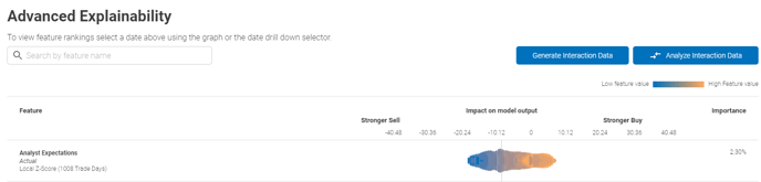
The screen above demonstrates what the initial output would look like. There is a search bar at the top that can be used to narrow down the features to only the ones of interest.
In the above example of single-factor plot, the Analyst Expectations factor z-score for each stock in the universe is plotted in the cloud:
- Low / High feature value represents the absolute value of the feature itself for each individual stock in the universe
- Then the features are plotted according to the strength of the signal they have been determined to generate - either a strong Buy or a Strong Sell
- In the example above, the high value of Analyst Expectation z-score factor translates to stronger Buy bias, whereas low value of expectations results in stronger Sell
Moving on to two-factor interactions.
If this is the first time the interaction data is being requested, the "Analyze Interaction Data" will be greyed out. The data will have to be generated first by pressing "Generate Interaction Data" button. The below prompt will come up:
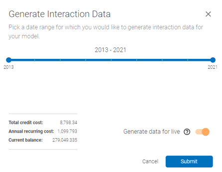 Generating data: In the above prompt, select the date range for the historical interaction data. Also enable/disable generation for live portion of the model - this will generate the data automatically for live model every time the model is re-trained, at the frequency that is pre-set at setup.
Interpreting two-factor interactions. Once the interaction data has been generated, the "Analyze Interaction Data" button will become available. Click it and select two features to analyze. The interaction plot will popup as below:
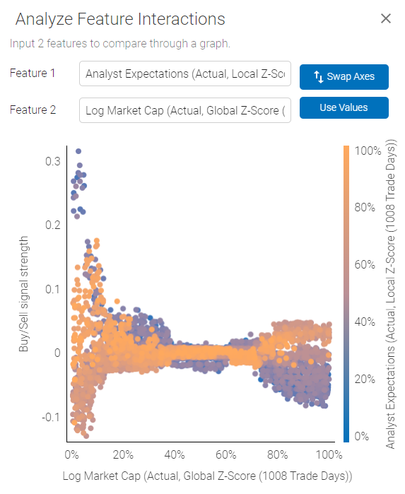 The plot demonstrates how the two selected features interact in relation to Buy/Sell signal strength.
Using the plot above as an example - we are looking at an interaction between Analyst Expectations and Log Market Cap. Analyst Expectations are represented by the color scale on the right, Log Market Cap is plotted on the X axis and Buy/Sell signal on the Y axis.
The plot shows us that Analyst Expectations are somewhat weakly correlated with a Buy/Sell signal for high Market Cap companies, and there is less scatter, outcome are more uniform for high Market Cap stocks. However, high Analyst Expectations for smaller companies could actually be a Sell signal, while low expectations for small companies could generate a strong Buy.
Note:
1) Axes can be swapped to get different perspective on the interactions.
2) Axes can be plotted based on Value or Percentiles, which normalizes factor values for potentially cleaner representation.
3) For binary variables (True / False) such as Sectors - value of 1 (bright orange) will represent True and 0 will be false.