Table of Contents
- Total Returns
- Turnover
- Factors
- Factor Performance
- Signals
- Rolling Signals
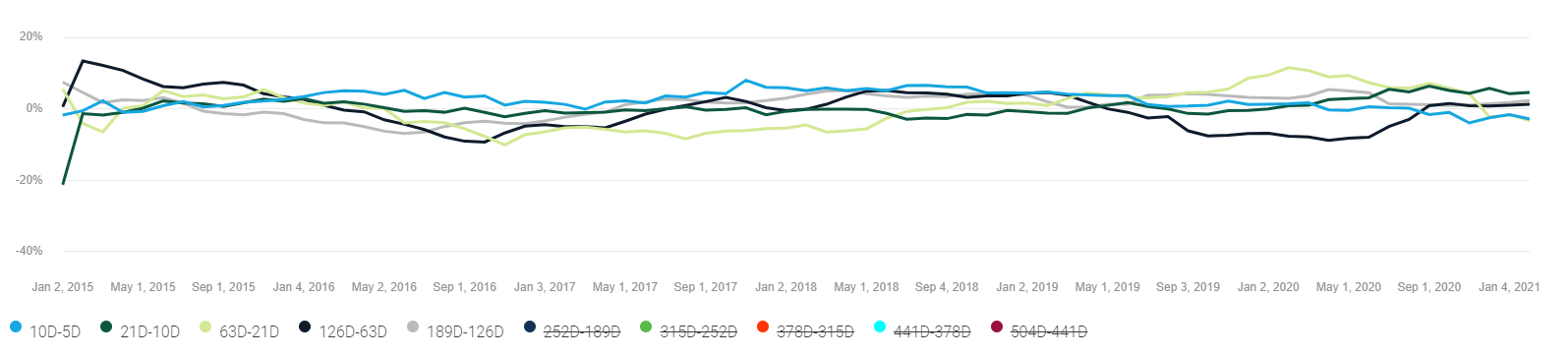
- Delta Signals
- Cumulative Returns
- Time Analysis
Total Returns
The total returns tab shows the cumulative performance for the portfolio over the selected time range. The performance of the backtested period is shown in blue, the performance of the live period is shown in orange. The performance of the benchmark is shown in black.

Turnover shows the turnover of the portfolio over the selected time period. Turnover is calculated as stocks bought in the time shown and is expressed as a percentage of total equity.

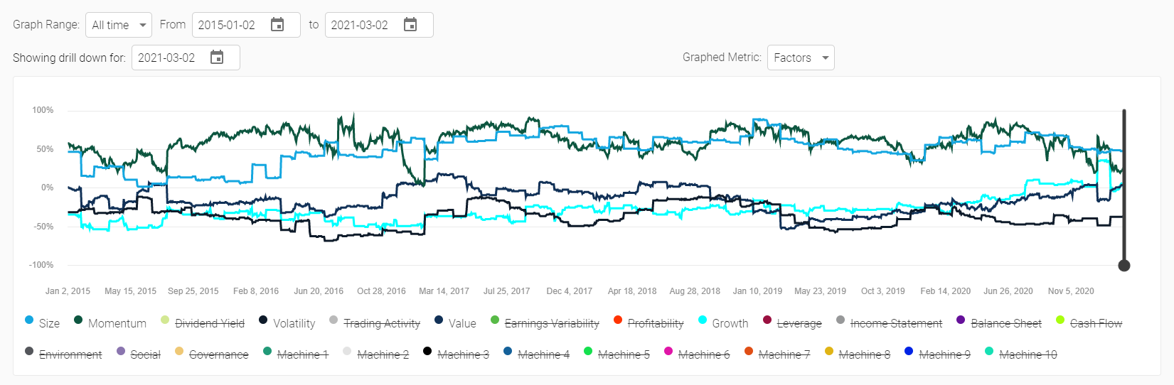
Factors shows the factor exposure of the portfolio over the selected time period. The factor scores are shown on a Z-Score basis, and the Z-Scores are calculated versus the stock universe at that moment in time. This means that, on average, stocks will average a factor score of 0 and +100% means you are overexposed to that factor (relative to the average) by 1 standard deviation and a score of -75% means you are underexposed by 0.75 standard deviations.
Factor exposure of the portfolio is calculated by summing the individual score of each stock multiplied by the percent weight in the portfolio. Factor exposures are calculated on a daily basis, but the chart can appear sawtooth in nature based on the rebalance period of the portfolio.
The factors labelled Machine 1 through 10 are machine learning based factors. We are not able to name these factors, but what we know is that Machine 1 is the largest risk factor and Machine 2 is the second largest and is completely uncorrelated to Machine 1. Machine 3 is the 3rd largest, 4 is 4th largest, etc, etc. You might imagine that Machine 1 is “market” risk and Machine 2 is “interest rate risk”, depending on the universe. These factors can change over time though, as they are calculated at each rebalance period and so what Machine 2 represents can change over time, the only thing that remains constant is that it is the 2nd most important risk factor (i.e. it could change from “interest rate risk” to “pandemic risk” during the COVID-19 crisis).
Factor exposures can be constrained through the portfolio settings menu.
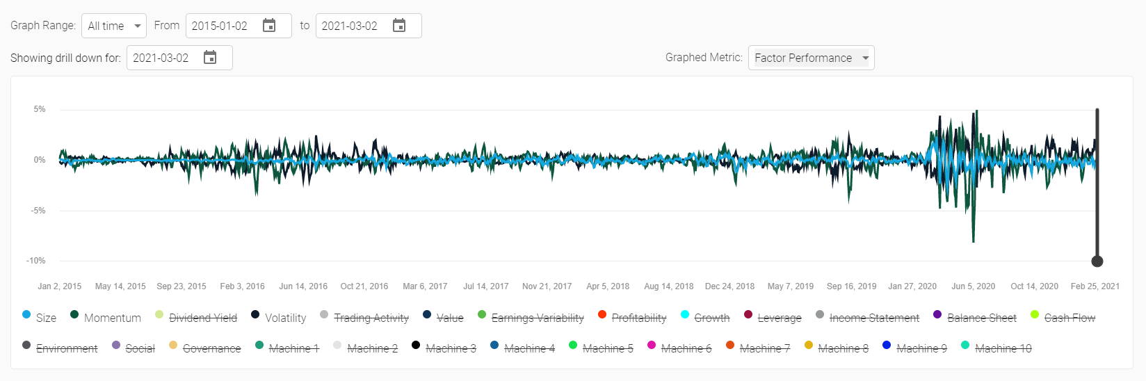
Factor performance shows how much of the trailing 5 day excess return can be attributed to each factor. For example, if Momentum shows a value of 1% that means that your portfolio gained 1% in value (relative to the equal weighted benchmark of your universe) due to its exposure to the Momentum factor. Importantly, this could be a result of either an under or an over exposure to the factor. If you had a Momentum exposure of -100% and Momentum underperformed by 1% then you would see a positive gain of 1% due to your Momentum factor exposure.
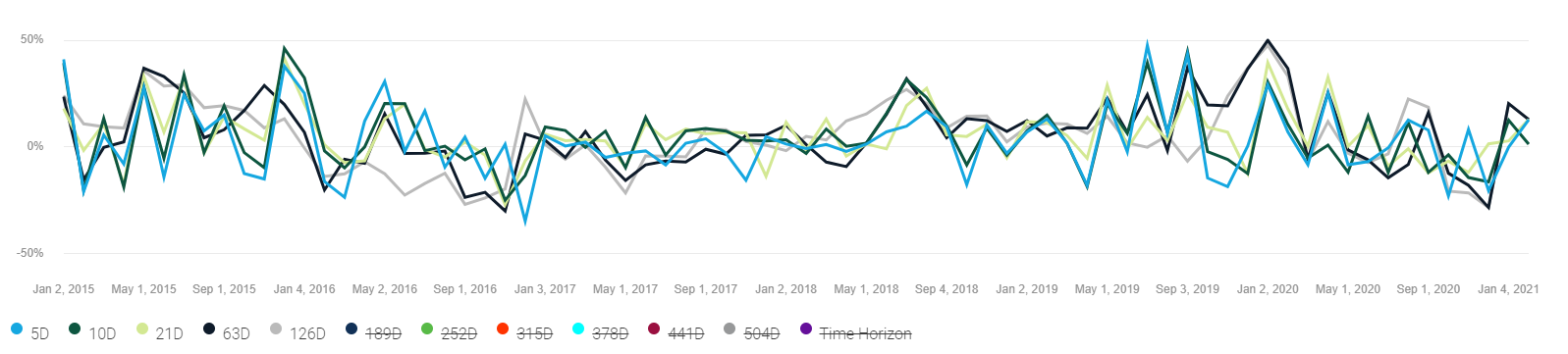
Signals shows the strength of your “signal” on any given rebalance day. Each data point represents the time range against which signal strength is evaluated, for example 21D represents 21 trading days or 1 month. If you had a 21D value of 5% on January 1, 2020 that means that from January 1, 2020 to January 31, 2020 (21 trading days) your picks were approximately 55% accurate (50% + the value shown on the chart). A value of -7% would mean 43% accuracy.
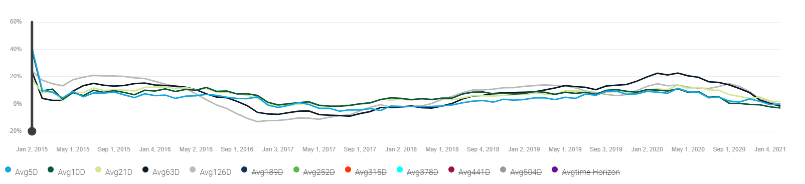
Rolling signals are identical to Signals, except they are smoothed over the trailing 12 periods. In the case of a daily rebalance model that means 12 trading days, in a monthly model that means a year (12 months). The smoothing is done on a simple basis (i.e. average of the 12 trailing results).
Delta signals shows the smoothed (using the same methodology as rolling signals) difference in signal strength between different time horizons. For example, 21D-10D means the difference in signal strength between the 21D signal and the 10D signal. If the value is positive that means the 21D signal is stronger than the 10D signal, if negative it is weaker.
Cumulative returns shows the returns by decile or quantile (you can select with the “slice” drop down in the top right corner) for the stocks in the universe. These are equal weight returns for each quantile (20%) or decile (10%), meaning if you had 100 stocks in your universe Decile 1 (D1) would be stocks ranked 1 through 10 and Decile 2 (D2) would be stocks ranked 11 through 20.
The stocks in each decile or quantile are recalculated as of each rebalance period and their returns are compounded on a daily basis until the next rebalance period.

Time analysis is one of the only graphs that is not impacted by the date range. Time analysis shows the average performance of each quantile or decile (select the slice dropdown to switch between the two), on average, over the entire life of the backtest versus a specific time period. The X-Axis references the time period (in trading days) and the Y-axis references the average observed return for that quantile or decile during the entire backtest. The values are annualized, and in a good model you would expect to see the highest returns for Q1 and D1 in a value that is closest to your investment horizon.
