An overview of feature-level model explainability
The model explainability tabs provide some visibility into the machine's decision making process. A higher score for a variable indicates that the variable was used more frequently in the model's decision making process during the chosen time range.
Ultimately, the decision making process underlying each model relies on multi-dimensional comparisons between all variables and stocks, which is not visualized on this screen.
Although it may seem intuitive to only use very important variables in your future models, this will often lead to lower performance overall.
Low to medium scored variables may be used as a flag for a good buy/sell decision, but are used less frequently than the higher scoring variables.
Very low or 0 value scores are a good indication that the underlying data of the variable is not predictive in your current model.
Experimentation with different variable sets will help identify the best available data for predicting good results in your model.
Table of Contents
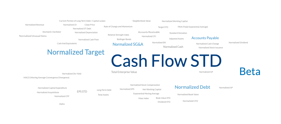
Word Cloud
The simplest explainability tab, the feature importance word cloud simply scales text size by feature importance for an intuitive and digestible graphic for understanding the most important features at a glance.
Feature Importance provides visibility into each feature's impact on model output and how that translates into Buy / Sell signals.
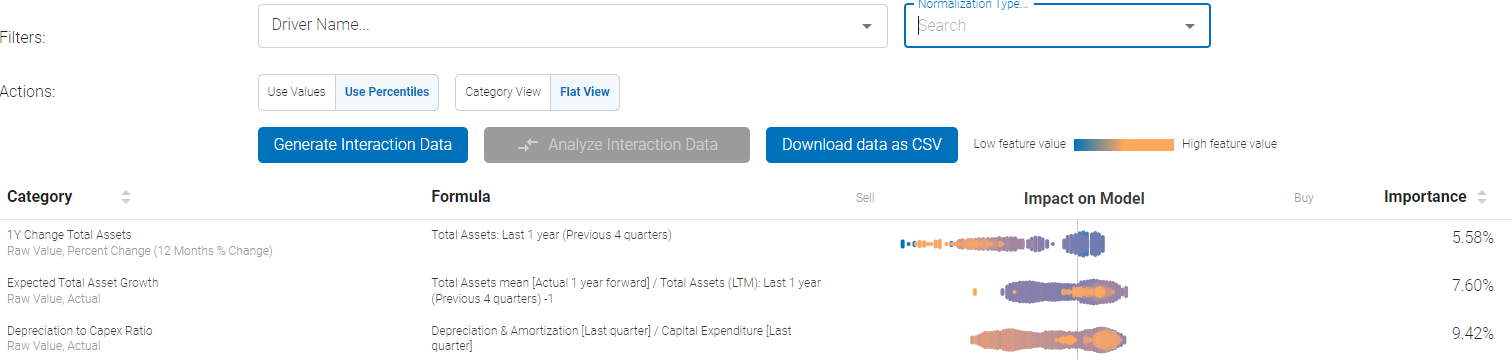
The screen above demonstrates what the initial output would look like. There is a search bar at the top that can be used to narrow down the features to only the ones of interest.
In the above example of single-factor plot, the raw value of 1 year change in total assets, analyst expectations for total asset growth, and depreciation to capex ratios for each stock in the universe is plotted in the cloud:
- Low / High feature value represents the absolute value of the feature itself for each individual stock in the universe
- Then the features are plotted according to the strength of the signal they have been determined to generate - either a strong Buy or a Strong Sell
- In the example above, the high value of Analyst Expectation z-score factor translates to stronger Buy bias, whereas low value of expectations results in stronger Sell
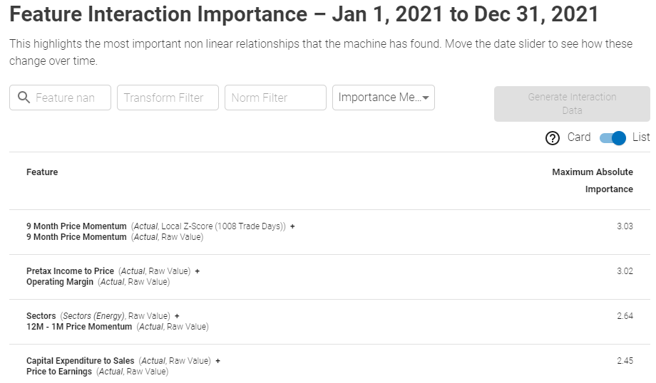
Feature Interaction Importance provides full transparency into interactions between all model's features, combined with the ability to sort, filter and rank these bi-variate interactions. The interactions are ranked by Importance Measure to zero in on the most important bi-variate interaction.
Generating data: If this is the first time the interaction importance data is being requested, the data need to be generated first by clicking the "Generate Interaction Data" button. The below prompt will come up:
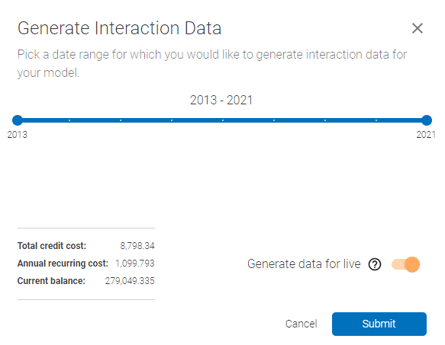 In the above prompt, select the date range and enable/disable generation for live portion of the model - this will generate the data automatically for live model every time the model is re-trained, at the frequency that is pre-defined at setup.
Interpretation:
The screen can be presented in both a list and card view, ranked by the importance measures as shown below:
List View:
Showcases bi-variate feature interactions, ranked by Importance
Card View:
Showcases bi-variate feature interactions in an intuitive card view. Y axis represents the Buy/Sell signal strengths, first feature is plotted on X axis and dot color gradient from blue (low) to orange (high) represents the value of the second feature.
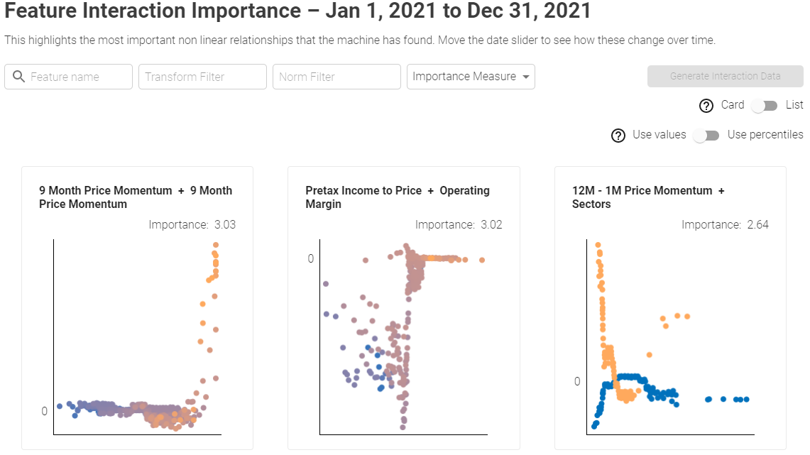
The search bar at the top that can be used to narrow down the features to only the ones of interest. User can also filter by Transformation and Normalization. For example you can filter only Absolute values (Transformation) and Local Z-scores (Normalization).
Lastly, the Importance Measure could be either the Maximum Absolute value or the Mean Absolute value, such as:
Interpreting two-factor interactions: clicking on each individual row or card will bring up a pop-out with detailed bi-variate chart.
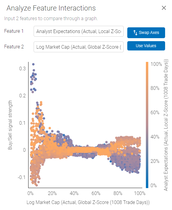 The plot demonstrates how the two selected features interact in relation to Buy/Sell signal strength.
Using the plot above as an example - we are looking at an interaction between Analyst Expectations and Log Market Cap. Analyst Expectations are represented by the color scale on the right, Log Market Cap is plotted on the X axis and Buy/Sell signal on the Y axis.
The plot shows us that Analyst Expectations are somewhat weakly correlated with a Buy/Sell signal for high Market Cap companies, and there is less scatter, outcome are more uniform for high Market Cap stocks. However, high Analyst Expectations for smaller companies could actually be a Sell signal, while low expectations for small companies could generate a strong Buy.
Note:
1) Axes can be swapped to get different perspective on the interactions.
2) Axes can be plotted based on Value or Percentiles, which normalizes factor values for potentially cleaner representation.
3) For binary variables (True / False) such as Sectors - value of 1 (bright orange) will represent True and 0 will be false.
Advanced: Shapley Values
The basis of model explainability is the idea of the Shapley value. Borrowed from cooperative game theory and the Nobel Prize-winning work of Lloyd Shapley, the Shapley value calculates the average contribution of different players to a particular outcome of a cooperative game. in the context of machine learning, it gives the average contribution of a feature to the difference between the predicted value for a particular sample and the mean value for the entire dataset.
Theoretically, this is done by averaging the differences in outcomes between all feature subsets that do not include the feature of interest with the feature subsets that do include the feature of interest for a particular sample.
However, this method of calculation is extremely computationally intensive and scales very poorly with the number of features. In practice the shapley values are approximated through various sampling methods which are beyond the scope of this article.
The feature importance plots in the Boosted Insights platform are an aggregation of shapley values for a feature across the entire dataset for the time period specified. Total feature contribution is calculated as the mean absolute Shapley value for a feature across the entire dataset normalized against all other features.
The feature interaction plot similarly aggregates Shapley values across the entire dataset for the specified time period but allows inspection of pairwise interaction effects between different variables.